If you happen to be viewing the article What is Bar Graph? on the website Math Hello Kitty, there are a couple of convenient ways for you to navigate through the content. You have the option to simply scroll down and leisurely read each section at your own pace. Alternatively, if you’re in a rush or looking for specific information, you can swiftly click on the table of contents provided. This will instantly direct you to the exact section that contains the information you need most urgently.
Learn What is Bar Graph? Discover how bar graphs are used to display and compare data in a clear and concise manner. Gain insights into the construction, interpretation, and significance of bar graphs in various fields.
Contents
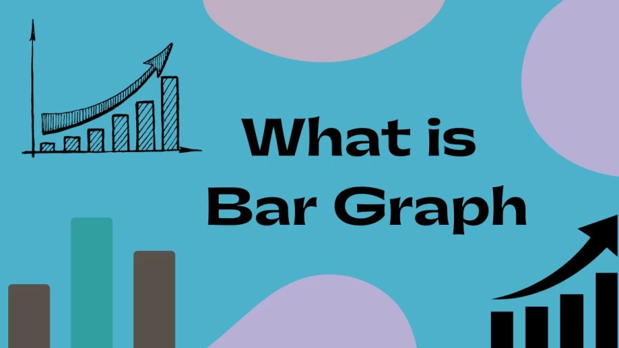
What is Bar Graph?
A bar graph, also known as a bar chart, is a visual representation of data using rectangular bars. It is a common form of data visualization used to display and compare categorical data. The graph consists of two axes: a vertical axis (y-axis) representing the values or frequencies of the data, and a horizontal axis (x-axis) representing the categories or groups being compared.
Each bar in the graph corresponds to a category and its length or height represents the magnitude or value of the data associated with that category. The bars are typically drawn vertically, but they can also be displayed horizontally.
Bar graphs are effective in illustrating comparisons between different categories or groups because the lengths or heights of the bars can be easily compared visually. They are commonly used to show trends over time, compare different options or choices, display survey results, or represent any data that can be categorised.
Bar graphs can be simple or complex, depending on the amount and complexity of the data being presented. They are widely used in various fields, including statistics, economics, business, education, and social sciences, to communicate information in a clear and concise manner.
Why is it called a Bar Graph?
A bar graph is called so because it uses bars to represent data visually. The term “bar” refers to the rectangular shape used to display the data points. These bars are arranged in such a way that they correspond to different categories or groups being compared. The length or height of each bar represents the magnitude or value of the data associated with that category.
The term “graph” refers to the visual representation of data using a coordinate system. In the case of a bar graph, the graph consists of two axes, a vertical axis (y-axis) and a horizontal axis (x-axis), which provide a framework for placing and measuring the bars.
The combination of bars and a graphical representation of data led to the term “bar graph” being used to describe this particular type of data visualisation. It is a simple and effective way to present categorical data in a visual format, making it easier to interpret and compare the values across different categories.
What is a Bar Graph with an Example?
A bar graph, also known as a bar chart, is a graphical representation of data using rectangular bars. It is commonly used to compare and display categorical data or discrete values. The length of each bar corresponds to the value it represents, allowing for easy visual comparison between different categories or data points.
Here’s an example to illustrate a bar graph:
Let’s say we want to compare the sales performance of three different products (A, B, and C) for a particular month. We have the following data:
- Product A: 100 units sold
- Product B: 75 units sold
- Product C: 120 units sold
To create a bar graph representing this data, we would start by drawing a horizontal or vertical axis. The axis represents the quantity or value being measured—in this case, the number of units sold. Along the axis, we would label the categories or data points (in this case, the three products A, B, and C).
Next, we would draw rectangular bars above or beside each category, with the length of each bar representing the corresponding value. In this example, we would draw a bar of length 100 units above the category A, a bar of length 75 units above the category B, and a bar of length 120 units above the category C.
The resulting bar graph would visually represent the sales performance of the three products, allowing for a quick and easy comparison. The height or length of each bar would provide a clear indication of the sales volume for each product.
The example provided here is a simple illustration. Bar graphs can have multiple categories and data points, and they can be customized in various ways, such as adding labels, legends, and color coding to enhance the visual representation and convey additional information.
What is a Simple Bar Graph?
A simple bar graph, also known as a bar chart, is a graphical representation of data using rectangular bars. It is a visual tool used to compare and display categorical data or discrete values.
In a simple bar graph, the length or height of each bar represents the quantity or value of the data it represents. The bars are typically arranged along the horizontal or vertical axis, with the length or height proportional to the data being depicted.
The graph usually has two axes: the x-axis (horizontal) and the y-axis (vertical). The x-axis represents the categories or labels being compared, while the y-axis represents the values or quantities associated with each category. The bars are drawn perpendicular to the axis, extending from the axis to the height or length corresponding to the data value.
Simple bar graphs are effective in presenting data that can be easily understood at a glance. They are commonly used to illustrate comparisons, trends, or distributions among different categories or groups. The bars can be colour-coded or labelled to provide additional information or to differentiate between categories.
What are the Types of Bar Graph?
Bar graphs, also known as bar charts, are used to represent data visually using rectangular bars. The length or height of the bars corresponds to the quantity or value being represented. Here are some common types of bar graphs:
- Vertical Bar Graph: This is the most common type of bar graph, where the bars are drawn vertically. The x-axis represents categories or labels, and the y-axis represents the values being measured.
- Horizontal Bar Graph: In this type of bar graph, the bars are drawn horizontally. The y-axis represents categories or labels, and the x-axis represents the values being measured. Horizontal bar graphs are useful when you have long labels or want to emphasise the magnitude of values.
- Grouped Bar Graph: Grouped bar graphs display multiple bars side by side for each category. This allows for easy comparison of values between different groups or subcategories. Grouped bar graphs are useful when you want to compare multiple sets of data within each category.
- Stacked Bar Graph: Stacked bar graphs show multiple bars stacked on top of each other to represent different components of a whole. The total height of the bar represents the total value, and each segment within the bar represents a proportion or contribution of each component.
- 100% Stacked Bar Graph: Similar to the stacked bar graph, the 100% stacked bar graph represents the components as percentages of the whole. The total height of the bar remains the same for each category, but the segments within the bar represent the relative proportions of the components.
- Clustered Bar Graph: Clustered bar graphs display groups of bars side by side for different categories. Each group represents a different category, and the bars within each group represent subcategories or data sets related to that category. Clustered bar graphs are useful when you want to compare values across different categories.
These are the main types of bar graphs commonly used to visually represent data. The choice of which type to use depends on the nature of the data being presented and the specific analysis or comparison you want to make.
How to Construct a Bar Graph?
Constructing a bar graph is a relatively simple process. Here are the steps to create a bar graph:
- Define the variables: Determine the data you want to represent in the bar graph. Identify the categories or groups you want to compare, as well as the numerical values associated with each category.
- Set up a coordinate system: Draw a set of perpendicular lines to create a rectangular grid. The horizontal line represents the x-axis, while the vertical line represents the y-axis. Label the axes accordingly, including units of measurement if applicable.
- Determine the scale: Decide on a suitable scale for both the x-axis and the y-axis. The scale should accommodate the range of values you’re working with while allowing for clear and easy-to-read bar heights.
- Draw the bars: For each category, draw a rectangular bar above the x-axis. The length of each bar corresponds to the value it represents. Make sure to keep consistent bar widths, although you can vary their thickness if needed for emphasis.
- Label the bars: Above each bar, write the category or group label. This helps viewers identify which bar represents which category.
- Add a title: Give your bar graph a clear and descriptive title that summarizes the data being represented. Place it above the graph.
- Add axis labels: Label the x-axis and y-axis to provide context and understanding of the data. Include the name of the variable being measured and the units of measurement, if applicable.
- Include a key or legend (if necessary): If your bar graph compares multiple sets of data or represents different variables, it’s essential to include a key or legend. This helps viewers understand the meaning of different colors, patterns, or symbols used in the graph.
- Polish and finalize: Review your bar graph for clarity, accuracy, and visual appeal. Make any necessary adjustments to ensure the graph is easy to interpret and understand.
Remember to choose appropriate colors, fonts, and visual elements to enhance the readability and visual impact of your bar graph.
Thank you so much for taking the time to read the article titled What is Bar Graph written by Math Hello Kitty. Your support means a lot to us! We are glad that you found this article useful. If you have any feedback or thoughts, we would love to hear from you. Don’t forget to leave a comment and review on our website to help introduce it to others. Once again, we sincerely appreciate your support and thank you for being a valued reader!
Source: Math Hello Kitty
Categories: Math